Tutorial: Posing and Body Language – Part 3
This week, Samy Fecih, a Character Animator working at London VFX studio Double Negative, brings us the third and final part of his series of tutorials on Posing and Body Language for digital artists.
Read Part 1 of the tutorial here
Read Part 2 of the tutorial here
Introduction
Welcome to the third of this series of tutorials. Now that we have seen how to think about our character, about acting, composition in the shot and how the character’s body should behave, we are going to explore how to create nice strong poses.
This instalment follows one of Disney’s 12 basic principles of animation, Appeal, and one principle which for me deserves to be the thirteenth, Weight and Balance.
http://www.youtube.com/watch?v=4tx3qtW3hIY
A good example of balance: The Amazing Lorador Brothers in Cirque du Soleil’s Saltimbanco show.
Appeal
To make a pose appealing, we need to make it strong – and for that, we need to convey a sense of the character through the lines that run through his pose. Straight lines are solid, firm and express something strong and serious. Curves express flexibility, weakness, fun or a sense of movement (this is why many hip hop dancers wear baggy clothing, making their movements smoother and more flexible).
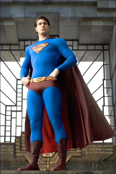
A still from The CW Television Network’s Smallville. Notice how Superman is all straight lines: solid and firm. You don’t mess with him; you’re not even sure he has a sense of humor.
Using alternate straight lines and curves will help to create the right amount of solidity and flexibility, and to give the pose the strength it needs, generating nice shapes and a strong line of action for the character. Simplifying the pose will also help to make the pose easier to read – and therefore stronger.
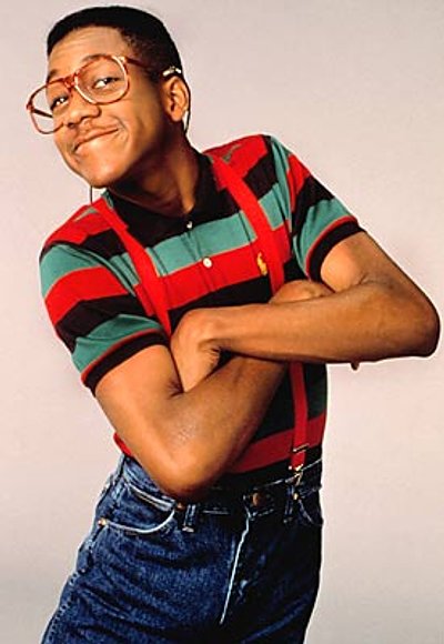
Urkel from the ABC/CBS sitcom Family Matters. Note the curves and straight lines in this pose, and how strong it is. You can see the character is funny: crazy but proud of it.
Use subtlety to play with the codes. For example, when we try to intimidate someone, we usually raise our heads and incline them backwards, to give the other person the sense that we are looking down on them. This creates the illusion of greater height, making us seem scarier.
Exaggeration is important when expressing big ideas. In life, we exaggerate to ensure we convey a feeling; we overact. This is why, on many occasions, we use our hands to emphasise our ideas. We should do the same in our pose to make it stronger – but again, we have to do this properly so as not to look cartoonish or out of context.
Weight and Balance
When we are creating a pose, the hips and shoulders show the audience where the character’s weight is. We know that we tend to put more weight on one leg than the other, and because of this, our hips are higher one side, with our torso leaning the other way to counterbalance and the shoulder usually following, depending on the action.
The hips really are our pivot: they help us to be on or off balance. Try a very simple exercise: stand with your back to a wall, pressing your butt and heels up against it, and to try to touch your toes. If your body is completely against the wall, you will fall forward as your hips will not be able to move backward to counterbalance.
The same applies to the shoulders. When we are sitting at a table, we tend to put our elbows on the table and let our weight fall through them: something that can easily be seen, since one shoulder will be higher than the other one.
A very simple exercise to see if a pose is in balance or not is to imagine a line perpendicular to the floor going from our centre pivot to the sky. The character should have approximately equal mass on both sides (but only approximately, since the muscles of the feet can compensate when mass is unevenly distributed).
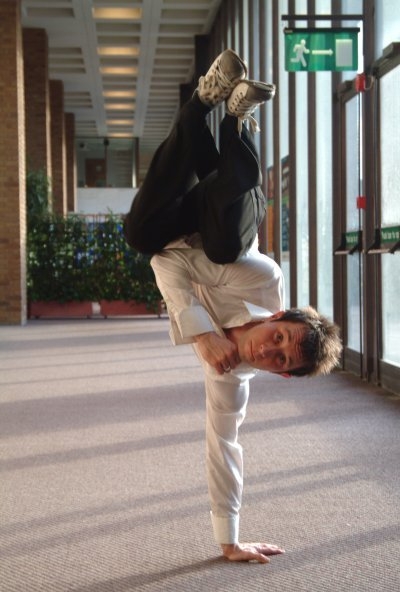
Mass is evenly distributed about a line perpendicular to the floor running upwards through the body’s pivot point, even when a character isn’t standing upright!
And finally, when we lift an object our mass is melded with that of the object, so we have to pay attention of the mass of the object plus that of the body to find the perfect balance.
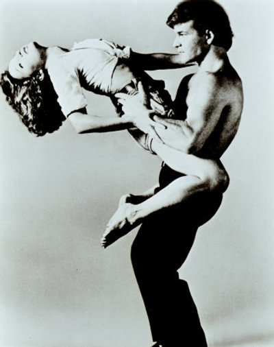
Patrick Swayze and Jennifer Grey in Liongate Entertainment’s Dirty Dancing. Body mass distribution differs between men and women: choose your pose accordingly!
Also note that men and women have different body mass distributions: women have a lower center of gravity because their hips are proportionally larger. Depending on our anatomy, weight is distributed differently when we lean backwards, and this can sometimes be tricky to control. For a good example, see the video at the start of this article.
That concludes this series of tutorials. We hope you have enjoyed reading them. For more animation advice, check out Samy’s site below.
 About Samy Fecih, Character Animator, Double Negative
Samy Fecih learned animation at Animation Mentor. While still at school, he worked at TeamTO on a TV series and then went on to work at Attitude Studio on the film ‘9’. He moved to London, working at Framestore on projects such as The Chronicles of Narnia: Prince Caspian, The Tale of Despereaux, Where the Wild Things Are and Avatar. Samy is currently a Character Animator at Double Negative, where he worked on The Sorcerer’s Apprentice and Iron Man 2. Samy started teaching in 2009 and, with two friends, created the Bring Your Own Animation events in London and Paris, where students and professionals can bring their work and get feedback from senior, professional animators.
