Q&A: Oblivion concept artist Thom Tenery

The top architectural designer reflects on the lessons learned over the course of a career that spans shopping malls, Doom 4 and Hollywood blockbusters: lessons distilled into his upcoming Gnomon Weekend Workshop.
 Thom Tenery received a Bachelor of Science in Architecture from the University of Texas, Arlington, and studied illustration and entertainment design at Art Center College of Design. After several years designing architecture, he made the transition to games, at studios including SCE and id Software, where he worked on Doom 4; and then to movie concept work and illustration.
His diverse list of clients includes Universal Pictures, Walt Disney Pictures, Warner Bros. Pictures, Activision Blizzard Inc., the Syfy channel, Playboy, Wizards of the Coast and and Tor Books, while his recent projects include sci-fi drama Oblivion and the as-yet-untitled Tron: Legacy sequel.
On Saturday 22 February, Thom will be distilling some of the lessons learned over the course of his varied career into his Weekend Workshop on Architectural Concept Design for the Gnomon School of Visual Effects. We caught up with him in the run-up to the workshop to discuss the art of creating believable virtual architecture.
CG Channel: You started out as an architectural designer and illustrator. What kind of work did you do?
Thom Tenery: I worked on movie theaters, shopping malls, various retail developments, a library, an elementary school and an assortment of office and residential projects. We drew primarily with CAD software, although because of my interest in sketching and painting, I was often tasked with putting together presentation material: the kind of stuff that involved hand drawing, painting, 3D visualization – and, on occasion, flythrough animations.
I knew early on that I wasn’t going to stay in the profession, but it took me years to get positioned to move out. For the last three years of my run, I was aggressively building a skill set for entertainment in my off hours.
CGC: People think of architecture as a safe, well-paid profession, unlike entertainment. What made you want to switch?
TT: I wanted to work in film. Or more accurately, I wanted to be a part of the genre-oriented, idea-driven, image-making world represented by Syd Mead, Ralph McQuarrie, Moebius, Chris Foss, Brian Froud, John Berkey and a hundred other designers and illustrators that I admired.
I loved architecture, but the profession wasn’t living up to the promise that design school had made. The work that I was doing on the day job was interesting, but it didn’t excite me the way that the work of architects like Lebbeus Woods, Neil Denari, Wes Jones, Morphosis, [Daniel] Libeskind and Zaha Hadid did. It took me a while to make the connection that the experimental work they were doing was essentially concept design.
There were also a lot of things heating up in the entertainment world at that time that interested me and put a spotlight on concept design as a profession. On the film front, there was a sci-fi/fantasy renaissance in progress (The Matrix, Lord of the Rings, Star Wars, Minority Report, and so on). The first next-gen game consoles were beginning to hit the market. Culture was shifting. Sci-fi and fantasy were no longer dirty words and the nerds were just beginning to inherit the earth. It seemed like a good time to course-correct my career.

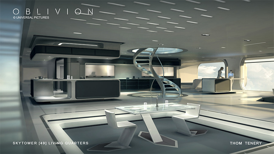
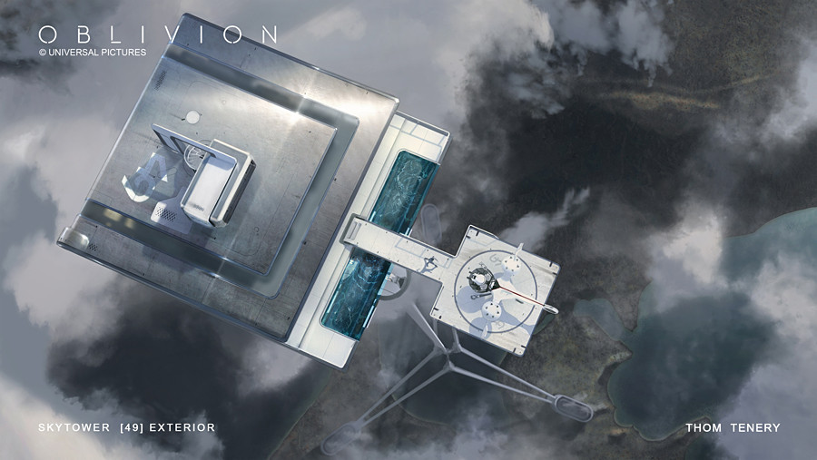
A concept image for Oblivion. An architectural background is handy when it comes to environment work, but training in any design discipline provides valuable ‘transfer credit’, argues Thom Tenery.
CGC: What benefits does having a formal architectural training have when it comes to concept design?
TT: It doesn’t hurt to know how a building goes together if you need to illustrate one that has been destroyed. But design is design. Training in any design discipline will have a comparable benefit.
There’s a lot of talk about the 10,000-hour rule, but I think you get transfer credit when it comes to the arts. There’s so much overlap between design disciplines that I think the hours you’ve logged in one will automatically bump you up in the next one.
The drawing and painting skill set required for concept design is the main barrier to entry for people looking to make a jump from another discipline. But skills can be acquired. You can build your own education and connect with artists now in a way that was unheard-of when I was just getting into design.
Today, the number of free or low-cost resources available online to learn the craft, and the number of places to get information and feedback are astounding. There aren’t enough hours in the year to consume all of the available tutorials, watch all of the artists you like at work, research every idea and read every book on the creative process. It’s all out there for the taking.
CGC: A lot of your recent projects have been futuristic or other-worldly. What do you look to bring into those kinds of concept images from the real world?
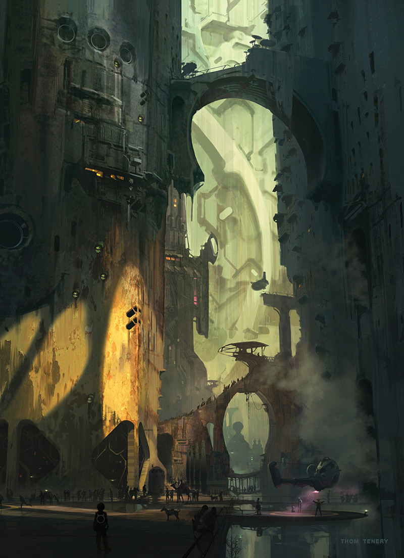
TT: Everything. We’re always porting reality over to fantasy in environment design, so any process that starts with observing a real place, then translating that into something else is going to get you most of the way there.
I always prefer a more nuanced discussion of these things, but if you’re looking for a checklist, the most direct approach that I can think of would be: look at a photo of a built environment that you like (a city street, a factory, an apartment, the alley behind the 7-11, whatever) and make a list of everything in it. Include what you can’t see: the stuff behind the wall, under the floor/street and above the ceiling. If you’re not sure what it is, what it does, or why it’s there, hit the internet and do the research. Then create an analogue in your design of everything on that list.
I think it’s worth pointing out that believability isn’t about ‘accuracy’ or adhering to some rule book about what is and isn’t factually correct. It’s a context-sensitive thing and often quite subjective. The credibility of an environment design has to be evaluated within the context of the project. On every game/film, there is an ongoing conversation about what makes a design work or not work for a specific story/narrative/scene.
The discussion often centers around what a place should ‘feel’ like. Slight variations in proportion, scale, lighting, materials and so on can radically alter the way a design ‘feels’, so part of the job is being sensitive to that and analytical about the impact of those design choices on the qualitative read of the whole. A design style slowly evolves that is based on that dialogue, the needs of the narrative and the taste of the director. In the end, believability takes a back seat to many other project concerns and really only shows up as a ‘sense of credibility’ or a ‘grounded-ness’.

Simple 3D mass models form the foundation of all Thom’s images, enabling him to explore lighting and spatial relationships, and to scout a location virtually to find a “composition worth committing to”.
CGC: A lot of the images on your website look like 2D paintings: do you use 3D software?
TT: I always use 3D software. Sketchbook aside, I can’t remember the last time I started an image without some sort of mass model. I rarely develop a model beyond a simple blockout, but I always start with something that will ‘put me there’. I want to set up a light, look through a camera, have a sense of the scale of things and understand the spatial relationships. And it adds an element of serendipity to the process, opening up the possibility of ‘discovering’ a composition.
Spinning around a block model and hunting for a composition worth committing to is part of the design development process as well. Troubleshooting the overall idea begins then. Faking spatial relationships for the sake of the composition is always an option, but, time permitting, I prefer to take a run at assembling a real space. In the case of game and film design, where navigable space and the geography of sets need to be understood, 3D is indispensable.
CGC: So what are the software tools of the architectural concept designer’s trade?
TT: I use Photoshop, Maya, Modo, ZBrush and SketchUp, roughly in that order of frequency. Use whatever interests or inspires you, or whatever you can afford. And by all means experiment with as many tools as possible. But don’t lose sight of the goal: great design.
Keep in mind that the tools are always going to change. The moment you lock down a pipeline that is dependent on one tool or technique, some more advanced tool will come out of nowhere that causes a gravitational shift in art departments everywhere and everyone will have to play catch-up. A couple of times a year, some artist stumbles on a bizarre new way of working with an existing program feature or invents a variation on an existing method that slightly alters the concept landscape.
Those changes accumulate and eventually affect the way we’re expected to work, the kind of work we’re expected to deliver, and slowly raise the bar when it comes to the speed [at which artists are expected to produce images]. But tools mastery obviously isn’t the the point of what we do. Content will always be most valuable: good design, originality, strong composition.

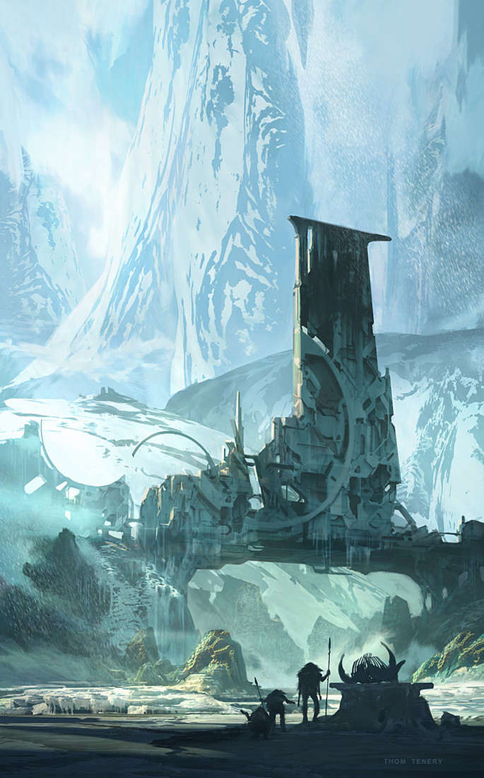
Research is crucial, advises Thom. Understanding how political, religious and economic forces influence architecture in the real world helps an artist to create work with the “integrity of a culture behind it”.
CGC: If you had to advise a young artist to focus on one thing in their images, what would it be?
TT: There are no secrets. The same principles of good design that apply to a vehicle, prop, character or story are true for environment and architectural design. I will, however, emphasize research.
Anyone can photobash their way to a ‘new architecture’ but managing to arrive at something that has the integrity of a culture behind it is a much more difficult thing to do. Digging into art history and making an attempt to understand the context in which the various forms of architecture that we see in the history books were built is the best way to equip yourself with ideas for how to generate and justify what you’re designing.
It’s not enough to know how something was built or what materials were used. The construction technologies involved are tied directly to the political, religious, economic and environmental forces acting on a civilization. I think the research part is half of the fun of the profession.
CGC: What’s the most common mistake you see young artists making?
TT: This is clichéd advice, but it bears repeating: think bigger than just concept art. Don’t have such a laser focus on what is just one small part of a bigger creative ecosystem. Be aware of it, but don’t spend your time chasing the latest trending thing.
It’s difficult, I know. When something inspires the hell out of you you just want to go do it. I think you’re better served channeling that inspiration into building something of your own. But then that is the latest trending concept thing, so now we’re back to that. It’s a bit of a paradox.
CGC: So if you could travel back in time, what advice would you give your own younger self?
TT: Study storytelling and start writing as soon as possible. It doesn’t seem like a worthy investment now, but the compound interest on that is going to pay out big time in about 10 years.
Register for Thom Tenery’s Weekend Workshop on Architectural Concept Design ($129 for three hours)
Full disclosure: CG Channel is owned by the Gnomon School of Visual Effects.
