Autodesk gets a new logo

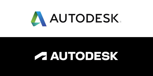
Before and after: Autodesk’s old corporate logo, used by the company since 2013, and below it, its “strong, simple” replacement, intended to suggest a “brand synonymous with doing”.
Autodesk has rolled out a new brand system, including a new company logo, and a new corporate font, brand colours and design guidelines for websites, marketing material and merchandise.
The change is described as “one of several bold moves we’re making as a company to reimagine the Autodesk brand – one that underscores our belief that a better world can be designed and made for all”.
New logomark riffs on abstract 3D mechanical forms
The most obvious part of the rebranding work is the new corporate logo, shown above alongside Autodesk’s previous logo, which the firm introduced in 2013.
The new logotype isn’t a radical change – still all sans-serif capitals, although in a rather bolder font – but the Autodesk ‘A’ has evolved into a semi-abstract logomark.
In the homepage animation on Autodesk’s new branding microsite, it’s revealed to be a plan view of a more complex stylised 3D mechanical part.
Autodesk describes the result as “a strong simple logo that illustrates a brand synonymous with doing”.
New corporate font from type legend Erik Spiekermann
The brand system also features a new corporate font, Artifakt, created by veteran design type designer Erik Spiekermann of Edenspiekermann, previously responsible for notable identities for Audi and Volkswagen.
It is now being used for headings on Autodesk’s homepage, generating a fair bit of visual impact.
Autodesk has also updated its brand colours, with the old Autodesk blue replaced with black, white, two shades of grey, and four accent colours: “clay, plant, iris and gold”.
At the time of writing, the new brand system has been implemented on the homepage of Autodesk’s website, but not the individual product pages, which retain the old colours and typography.
No changes to the individual product logos so far
Autodesk’s blog post doesn’t mention changes to the logos of individual products, like 3ds Max and Maya, but since the current versions are neither clay, plant, iris or gold, we imagine that updates are due.
If you’re a design enthusiast, Autodesk’s brand hub has a detailed description of the new design system, and the human qualities it is supposed to convey.
If you’re a branding sceptic, there’s a rather wicked parody of the whole process in the comments thread to this CGPress news story about the new logo.

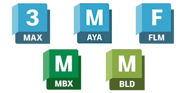
Updated 5 March 2022: Autodesk has now rolled out new product logos for its Media and Entertainment products, to coincide with the 2023 releases of 3ds Max, Maya, MotionBuilder and Mudbox.
On the top row (left to right): 3ds Max, Maya, Flame. Bottom row: Mudbox, MotionBuilder.
Read Autodesk’s blog post announcing the new logo and brand system
